The barcode, rebuilt in CSS.
Twenty-two absolutely-positioned bars and one line of text rotated with writing-mode.
No image, no SVG, no JavaScript, no ::before tricks. Every dimension is a percentage of the box, so
it is resolution-free — set a width and it redraws crisp at any size, including print.
Hover it. It scans, and tells you what it really is.
A beam runs the length of the code, bottom to top, the same direction the number reads. Everything
behind it is decoded. 728473784337 and PATHPEPTIDES are both twelve characters,
so the decoded run lands in exactly the same box — nothing shifts, nothing reflows. It holds the name for a beat, then the beam sweeps back down and re-encodes, leaving the code as it found it.
The two strings live in stacked layers that share one
--s scan variable, so the light and the boundary between encoded and decoded are the same line
by construction — they cannot drift apart, even mid-transition. The half-lit glyph at the beam is a
real character caught between states, not an effect.
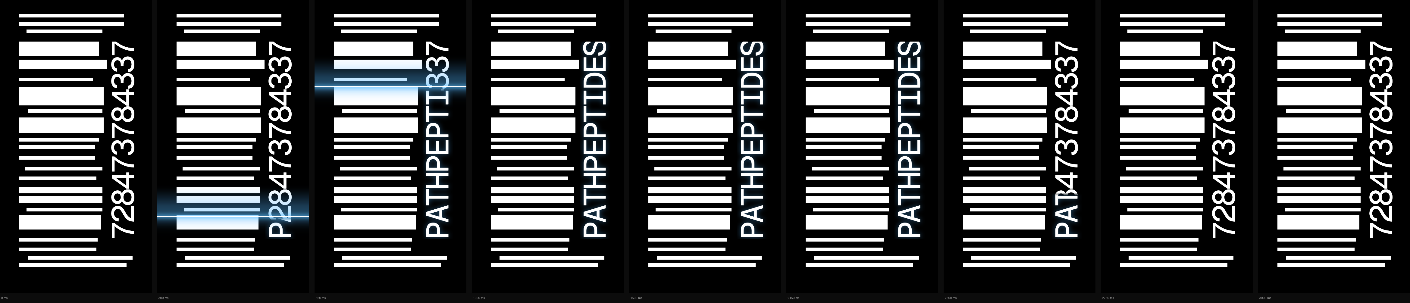
One shot, two passes of one light, at true timings: 1.00 s sweeping up to decode, 1.15 s holding the name, 0.85 s sweeping back down to re-encode. Both passes are linear — a scanner travels at constant speed — and both ends of the travel sit off the box, so there is no start or stop to see. The return is slightly quicker than the read, which is what keeps it from feeling like a rewind.
Same size, side by side.
Your PNG on the left, the CSS on the right, both the full 252 × 486 artwork — quiet zones included. The third is the two overlaid: red is source-only, green is CSS-only, yellow is agreement.
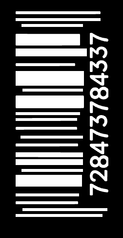
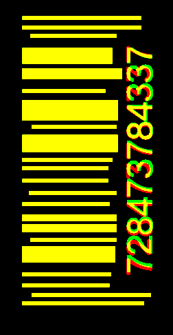
The bar field differs by 25 pixels out of 87,000 — the geometry was measured off your PNG row by row rather than eyeballed. The digit run reads bottom to top, glyph tops facing left, which is the direction in your original; the strip lands on exactly the right box, x 184–221, twelve characters over 328 px. What is left over is letterform only: yours is a condensed face I do not have. I fitted five candidates against it — PP Mori at two weights, Helvetica Condensed, Avenir Next Condensed and Impact — solving cap height and tracking for each so the comparison was fair, and every one landed within two points of Geist Mono. Swapping the face is one line if you have the real one.
Any size, still sharp.
One declaration each — width:85px through width:400px. The bars, the
gaps, the number, the quiet zones and the scan all scale together because nothing is fixed in pixels.
Colour, number and payload are variables.
The digits are real selectable text, so any code works — swap the string and the run re-fits itself. The decoded string is just the second layer, so the easter egg can say anything twelve characters long. Colour is three custom properties.
On a light ground set --bar-blend:multiply — screen is right for a dark
one and would wash a cream card out.
Trigger it from anywhere, once.
Put data-barcode-scan on any ancestor — a footer, a card, a hero — and entering
anywhere in that region runs the shot. It fires once per page load, plays the full three seconds
whether or not the cursor stays, and leaves the number as it was.
/* ── PATH barcode ────────────────────────────────────────────────────
   Pure CSS. No images, no SVG, no JS.
   Size it by setting a width (or height) on .barcode — everything
   inside is a percentage, so it scales to any box.
   Recolour with --bar-ink / --bar-bg / --bar-beam.

   The box is the full 252×486 artwork including its quiet zones, so
   nothing sits flush to an edge and nothing gets clipped.

   Hover (or focus) runs a scanner beam along the code, decodes the
   number behind it, holds it for a beat, then puts the number back.
   Two text layers share one masked boundary, so they can never drift
   apart.                                                              */

@property --s {syntax:'<percentage>';initial-value:-45%;inherits:true}
@property --bo{syntax:'<number>';    initial-value:0;    inherits:true}

/* One shot, start to finish: sweep up decoding, hold the decoded name for
   a beat, then re-encode and leave the number as it was found.
   0–33%  sweep (1.0s)   33–70% hold (1.1s)   70–100% return (0.9s)      */
@keyframes bar-scan{
  0%   {--s:-45%; --bo:0}
  1.5% {--bo:1}
  33%  {--s:140%; --bo:1}
  38%  {--bo:0}
  70%  {--s:140%; --bo:0; animation-timing-function:cubic-bezier(.45,0,.25,1)}
  100% {--s:-45%; --bo:0}
}

.barcode{
  --bar-ink:#fff;
  --bar-bg:#000;
  --bar-beam:#4fb3ff;
  --bar-blend:screen;      /* use multiply on a light --bar-bg         */
  --bar-size:20.319cqw;    /* digit cap-height, tuned to the source    */
  --bar-track:-0.06143em;  /* condenses the run to the measured strip  */
  --bar-lift:0.794cqw;     /* ink sits high in the em box; push it down*/
  position:relative;
  container-type:size;
  aspect-ratio:252/486;
  background:var(--bar-bg);
  overflow:hidden;
}

/* A) on its own — hovering the code runs the shot; it may run again.   */
.barcode:has(b.dec):hover:not([data-barcode-scan] *),
.barcode:has(b.dec):focus-visible:not([data-barcode-scan] *){
  animation:bar-scan 3000ms linear 1 forwards;
}

/* B) armed to a region — put data-barcode-scan on any ancestor (a
   footer, a card, a hero) and entering ANYWHERE in it runs the shot.
   It runs ONCE per page load: the animation is declared paused and
   hovering only ever resumes it, and play-state does not restart an
   animation the way re-matching :hover restarts a transition.         */
[data-barcode-scan] .barcode:has(b.dec){
  animation:bar-scan 3000ms linear 1 forwards paused;
}
[data-barcode-scan]:hover        .barcode:has(b.dec),
[data-barcode-scan]:focus-within .barcode:has(b.dec){
  animation-play-state:running;
}

.barcode i{
  position:absolute;
  background:var(--bar-ink);
  top:calc(var(--t)*1%); height:calc(var(--h)*1%);
  left:calc(var(--l)*1%); width:calc(var(--w)*1%);
}

.barcode b{
  position:absolute; right:8.730%; top:13.786%; height:67.490%;
  display:flex; align-items:center; justify-content:center;
  writing-mode:vertical-rl;              /* +180° below = glyphs 90°ccw, */
  rotate:0deg;                           /* reading bottom-to-top        */
  transform:translateY(var(--bar-lift)) rotate(180deg);
  font:400 var(--bar-size)/1 'Geist Mono',ui-monospace,'SF Mono',Menlo,monospace;
  letter-spacing:var(--bar-track);
  color:var(--bar-ink);
  font-variant-numeric:tabular-nums;
  user-select:all;
}
/* the wipe. Local top = page bottom after the 180° turn, so the reveal
   runs bottom-to-top, the same direction the code reads.              */
.barcode b.enc{
  -webkit-mask-image:linear-gradient(to bottom,transparent 0,transparent calc(var(--s) - 1.5%),#000 var(--s));
          mask-image:linear-gradient(to bottom,transparent 0,transparent calc(var(--s) - 1.5%),#000 var(--s));
}
.barcode b.dec{
  -webkit-mask-image:linear-gradient(to bottom,#000 0,#000 calc(var(--s) - 1.5%),transparent var(--s));
          mask-image:linear-gradient(to bottom,#000 0,#000 calc(var(--s) - 1.5%),transparent var(--s));
  text-shadow:0 0 9px color-mix(in srgb,var(--bar-beam) 45%,transparent);
}

/* the beam. Both halves read the same --s, so the light and the wipe
   boundary are the same line by construction. --bo carries it out on
   the return leg, so the code re-encodes quietly.                     */
.barcode u{position:absolute;inset:0;z-index:3;pointer-events:none;text-decoration:none;opacity:var(--bo)}
.barcode u::before,.barcode u::after{
  content:''; position:absolute; left:-6%; right:-6%;
  bottom:calc(18.724% + var(--s)*0.6749);
  mix-blend-mode:var(--bar-blend);
}
.barcode u::before{                       /* soft wash                 */
  height:13%; margin-bottom:-6.5%;
  background:linear-gradient(to top,transparent,var(--bar-beam),transparent);
  opacity:.32; filter:blur(4px);
}
.barcode u::after{                        /* the core line             */
  height:2px; margin-bottom:-1px; background:#fff;
  box-shadow:0 0 7px 1px var(--bar-beam),
             0 0 20px 4px color-mix(in srgb,var(--bar-beam) 55%,transparent);
}

@media (prefers-reduced-motion:reduce){
  .barcode:has(b.dec):hover:not([data-barcode-scan] *),
  .barcode:has(b.dec):focus-visible:not([data-barcode-scan] *),
  [data-barcode-scan] .barcode:has(b.dec){animation:none}
}
This is the one place the component asks for JavaScript, and it is three lines. Hover alone is the no-JS baseline — but a visitor who leaves halfway would cancel the shot. Adding a class on first entry lets the same animation carry on without the cursor:
/* ── PATH barcode ────────────────────────────────────────────────────
   Pure CSS. No images, no SVG, no JS.
   Size it by setting a width (or height) on .barcode — everything
   inside is a percentage, so it scales to any box.
   Recolour with --bar-ink / --bar-bg / --bar-beam.

   The box is the full 252×486 artwork including its quiet zones, so
   nothing sits flush to an edge and nothing gets clipped.

   Hover (or focus) runs a scanner beam along the code, decodes the
   number behind it, holds it for a beat, then puts the number back.
   Two text layers share one masked boundary, so they can never drift
   apart.                                                              */

@property --s {syntax:'<percentage>';initial-value:-45%;inherits:true}
@property --bo{syntax:'<number>';    initial-value:0;    inherits:true}

/* One shot, start to finish: the beam sweeps up decoding, the name is
   held for a beat, then the beam sweeps back down re-encoding, and the
   number is left exactly as it was found. Two passes of one light.
   0–33.3% up (1.00s)  33.3–71.7% hold (1.15s)  71.7–100% back (0.85s)
   Both passes are linear, so the light keeps a constant speed and the
   return reads as a deliberate second sweep, not a rewind.            */
@keyframes bar-scan{
  0%     {--s:-45%; --bo:0}
  1.5%   {--bo:1}
  33.3%  {--s:140%; --bo:1}
  36%    {--bo:0}
  71.7%  {--s:140%; --bo:0}
  73.2%  {--bo:1}
  98.5%  {--bo:1}
  100%   {--s:-45%; --bo:0}
}

.barcode{
  --bar-ink:#fff;
  --bar-bg:#000;
  --bar-beam:#4fb3ff;
  --bar-blend:screen;      /* use multiply on a light --bar-bg         */
  --bar-size:20.319cqw;    /* digit cap-height, tuned to the source    */
  --bar-track:-0.06143em;  /* condenses the run to the measured strip  */
  --bar-lift:0.794cqw;     /* ink sits high in the em box; push it down*/
  position:relative;
  container-type:size;
  aspect-ratio:252/486;
  background:var(--bar-bg);
  overflow:hidden;
}

/* A) on its own — hovering the code runs the shot; it may run again.   */
.barcode:has(b.dec):hover:not([data-barcode-scan] *),
.barcode:has(b.dec):focus-visible:not([data-barcode-scan] *){
  animation:bar-scan 3000ms linear 1 forwards;
}

/* B) armed to a region — put data-barcode-scan on any ancestor (a
   footer, a card, a hero) and entering ANYWHERE in it runs the shot.

   Two rules declare the SAME animation. Hover alone is the no-JS
   baseline: leave early and the shot is cancelled, so the code snaps
   back to the number rather than stranding half-decoded.

   Add the .barcode-scanned class (three lines of JS below) and the
   shot survives the cursor leaving and plays out once per page load.
   Because both rules resolve to an identical animation value, adding
   or dropping :hover never restarts it.

     for (const el of document.querySelectorAll('[data-barcode-scan]'))
       for (const ev of ['pointerenter','focusin'])
         el.addEventListener(ev,
           () => el.classList.add('barcode-scanned'), {once:true})

   A pure-CSS latch is not possible here: CSS ignores animated custom
   property values when resolving animation-* properties, so an
   animation cannot arm another one.                                   */
[data-barcode-scan]:hover            .barcode:has(b.dec),
[data-barcode-scan]:focus-within     .barcode:has(b.dec),
[data-barcode-scan].barcode-scanned  .barcode:has(b.dec){
  animation:bar-scan 3000ms linear 1 forwards;
}

.barcode i{
  position:absolute;
  background:var(--bar-ink);
  top:calc(var(--t)*1%); height:calc(var(--h)*1%);
  left:calc(var(--l)*1%); width:calc(var(--w)*1%);
}

.barcode b{
  position:absolute; right:8.730%; top:13.786%; height:67.490%;
  display:flex; align-items:center; justify-content:center;
  writing-mode:vertical-rl;              /* +180° below = glyphs 90°ccw, */
  rotate:0deg;                           /* reading bottom-to-top        */
  transform:translateY(var(--bar-lift)) rotate(180deg);
  font:400 var(--bar-size)/1 'Geist Mono',ui-monospace,'SF Mono',Menlo,monospace;
  letter-spacing:var(--bar-track);
  color:var(--bar-ink);
  font-variant-numeric:tabular-nums;
  user-select:all;
}
/* the wipe. Local top = page bottom after the 180° turn, so the reveal
   runs bottom-to-top, the same direction the code reads.              */
.barcode b.enc{
  -webkit-mask-image:linear-gradient(to bottom,transparent 0,transparent calc(var(--s) - 1.5%),#000 var(--s));
          mask-image:linear-gradient(to bottom,transparent 0,transparent calc(var(--s) - 1.5%),#000 var(--s));
}
.barcode b.dec{
  -webkit-mask-image:linear-gradient(to bottom,#000 0,#000 calc(var(--s) - 1.5%),transparent var(--s));
          mask-image:linear-gradient(to bottom,#000 0,#000 calc(var(--s) - 1.5%),transparent var(--s));
  text-shadow:0 0 9px color-mix(in srgb,var(--bar-beam) 45%,transparent);
}

/* the beam. Both halves read the same --s, so the light and the wipe
   boundary are the same line by construction — on the way up and on
   the way back. --bo only hides it during the hold and off-box.       */
.barcode u{position:absolute;inset:0;z-index:3;pointer-events:none;text-decoration:none;opacity:var(--bo)}
.barcode u::before,.barcode u::after{
  content:''; position:absolute; left:-6%; right:-6%;
  bottom:calc(18.724% + var(--s)*0.6749);
  mix-blend-mode:var(--bar-blend);
}
.barcode u::before{                       /* soft wash                 */
  height:13%; margin-bottom:-6.5%;
  background:linear-gradient(to top,transparent,var(--bar-beam),transparent);
  opacity:.32; filter:blur(4px);
}
.barcode u::after{                        /* the core line             */
  height:2px; margin-bottom:-1px; background:#fff;
  box-shadow:0 0 7px 1px var(--bar-beam),
             0 0 20px 4px color-mix(in srgb,var(--bar-beam) 55%,transparent);
}

@media (prefers-reduced-motion:reduce){
  .barcode:has(b.dec):hover:not([data-barcode-scan] *),
  .barcode:has(b.dec):focus-visible:not([data-barcode-scan] *),
  [data-barcode-scan]:hover        .barcode:has(b.dec),
  [data-barcode-scan]:focus-within .barcode:has(b.dec),
  [data-barcode-scan].barcode-scanned .barcode:has(b.dec){animation:none}
}
Two CSS rules declare the identical animation — one on
:hover, one on .barcode-scanned — so dropping the hover never restarts it, and once the
shot has finished it will not run again.
Without the script it still behaves. Hovering runs the shot; leaving early cancels it and the
code snaps straight back to the number. It can never strand half-decoded either way. I tried hard to latch this
in pure CSS and it cannot be done: CSS deliberately ignores animated custom-property values when resolving
animation-*, so one animation cannot arm another.
This whole panel is the trigger. Move your cursor anywhere inside it — not the barcode — and watch it decode, hold, and reset. Then leave and come back: it will not replay.
Reload the page to arm it againMeasured both ways, leaving 1.4 s in — right at the decoded hold. With the script: 140% → 111% → −45%, it keeps going and puts the number back on its own. Without it: 140% → −45%, cancelled and snapped straight back. Both end on the number; neither strands.
Copy this.
Two files' worth, around 2.6 KB before compression, and still no JavaScript. The scan is a transition on a registered custom property; the decode is two masked text layers reading that same property.
<div class="barcode" style="width:252px" role="img" aria-label="Barcode 728473784337" tabindex="0">
  <i style="--t:4.733;--h:1.235;--l:12.698;--w:69.048"></i>
  <i style="--t:7.613;--h:1.235;--l:12.698;--w:69.048"></i>
  <i style="--t:10.082;--h:1.235;--l:17.460;--w:50.000"></i>
  <i style="--t:14.198;--h:4.938;--l:12.698;--w:52.381"></i>
  <i style="--t:20.370;--h:3.292;--l:12.698;--w:57.937"></i>
  <i style="--t:26.543;--h:1.235;--l:12.698;--w:48.413"></i>
  <i style="--t:29.835;--h:6.173;--l:12.698;--w:55.556"></i>
  <i style="--t:37.243;--h:1.235;--l:18.254;--w:49.206"></i>
  <i style="--t:40.123;--h:5.350;--l:12.698;--w:55.556"></i>
  <i style="--t:47.119;--h:1.235;--l:12.698;--w:52.381"></i>
  <i style="--t:49.588;--h:1.235;--l:12.698;--w:50.000"></i>
  <i style="--t:53.292;--h:1.235;--l:12.698;--w:50.000"></i>
  <i style="--t:56.996;--h:1.235;--l:16.667;--w:50.794"></i>
  <i style="--t:60.288;--h:1.235;--l:12.698;--w:50.794"></i>
  <i style="--t:63.992;--h:2.058;--l:12.698;--w:54.762"></i>
  <i style="--t:66.872;--h:2.469;--l:12.698;--w:54.762"></i>
  <i style="--t:70.988;--h:1.235;--l:17.460;--w:50.000"></i>
  <i style="--t:73.457;--h:4.938;--l:12.698;--w:53.968"></i>
  <i style="--t:81.276;--h:1.235;--l:12.698;--w:51.587"></i>
  <i style="--t:84.568;--h:1.235;--l:12.698;--w:50.794"></i>
  <i style="--t:87.449;--h:1.235;--l:18.254;--w:69.048"></i>
  <i style="--t:89.918;--h:1.235;--l:12.698;--w:70.635"></i>
  <b class="enc">728473784337</b>
  <b class="dec">PATHPEPTIDES</b>
  <u></u>
</div>